How to Brand Your Instagram Account
Being consistent with your brand is essential in business, because the more consistent you are, the more brand recognition you build. Brand recognition means that when someone sees your storefront sign, social media post, rack card, etc, they instantly know it’s your brand without having to see your business’ name. Think of the Starbucks mermaid and the Nike swoosh.
Why does this matter? It takes an average of seven times for someone to see you or hear about you before committing to purchasing your offer, so brand recognition makes a dent in that seven.
While you may not have a business as large as Starbucks or Nike, you can still take advantage of brand recognition. Here’s how to brand your Instagram account for ultimate brand recognition.
Use a photo of you or your logo mark as your profile picture.
If you’re a solopreneur or you’re the face of your business, I recommend using a professionally shot picture of yourself that reflects your brand colors. Make sure you’re looking right at the camera to build connection with your audience on first glance. (Looking away from the camera makes you seem aloof!)
Otherwise, use your logo mark, which is the icon in your logo minus your business name. If you make a product, you can use a product photo for this.
It’s best not to change your profile picture too often, as it’s always present next to every single post. Maintaining the same, on brand profile photo is the foundation of building brand awareness on Instagram.
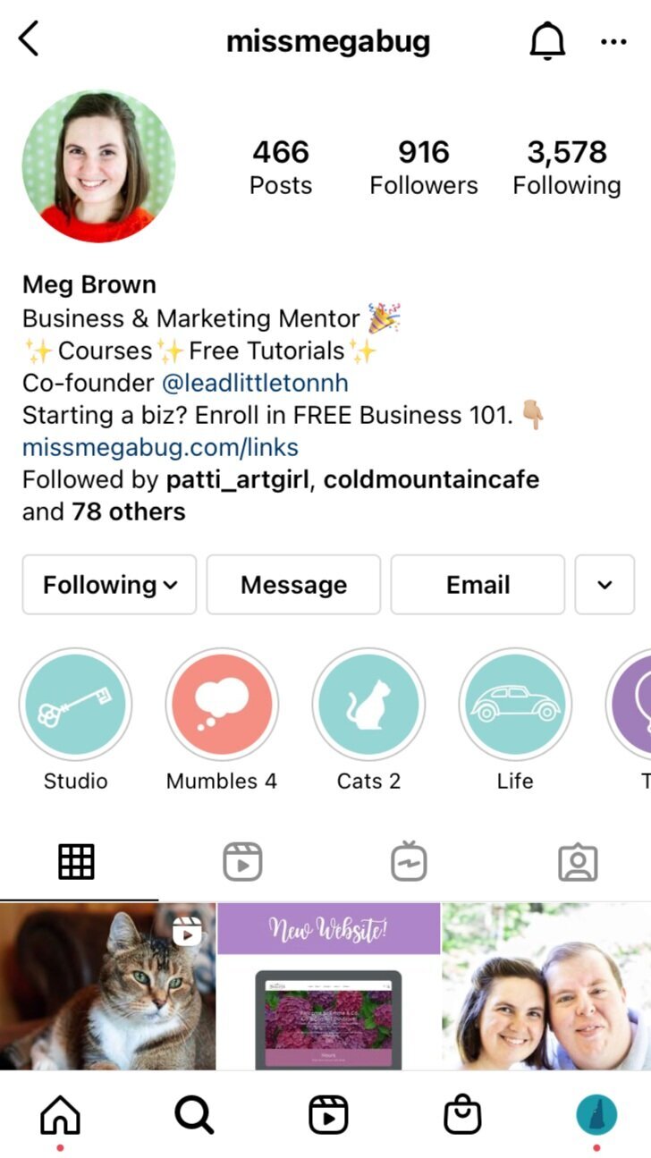
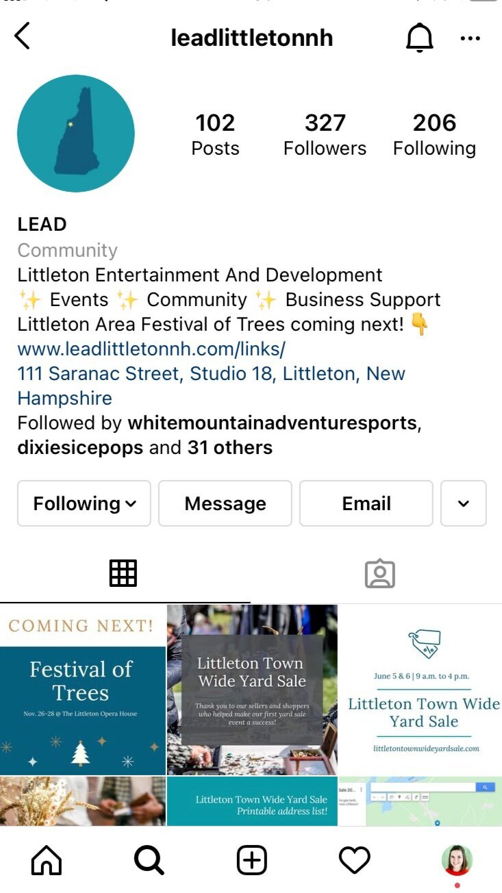
Write a captivating - and converting! - Instagram bio.
The standard formula is “I help TARGET MARKET with THEIR PROBLEM by YOUR OFFER.”
This is certainly effective, but you’re welcome to have fun and mix it up a bit, as long as your bio is clear. You can also use emojis for emphasis, and to make scanning easier!
Here’s what my Instagram bios look like:
Build a link tree.
The main goal of marketing is to get people to your website, which is your primary sales tool. After all, it's where people book your service or buy your product.
But on Instagram, you only get one link. And it's super important to make it easy and link directly to the service or product you're mentioning ("link in bio" anyone?).
What to do?
Enter Linktree.
Linktr.ee is a free service that allows you to create a page with numerous buttons. You'll use your Linktree link (mine's linktr.ee/missmegabug) in your Instagram bio's website spot and whenever someone clicks on it, they'll be brought to multiple buttons to click on.
This allows you to click you specific offers, blog posts, and more.
You can also customize the look of your Linktree (to an extent). There is a paid version, but the free one is totally usable.
Learn the ins and outs of Linktree in the tutorial below!
Once you get the swing of Linktree, you can add an unlinked page to your website that can take its place and allow you more customizations and better branding. Mine is missmegabug.com/links.
Search your website provider (like Squarespace) then “custom Instagram link tree,” or something like that.
Customize your Instagram Highlights Covers.
When you want an Instagram Story to stick around longer than 24 hours, add it to a Highlight.
Highlights appear below your link in bio and above your posts. They’re in the shape of a circle and you can click on each one (just like Stories) to see the collection of Stories classified as that Highlight.
You can update the thumbnail photo of your Highlights to be on brand.
I'll show you how to design your own Highlights covers - two ways! - on Canva, a FREE cloud-based design software along with how to add them to Instagram. Love short-cuts? Click here for the template!
Don’t have a Canva account? Click here.
Ensure your posts adhere to your brand.
Many business owners are catching onto Canva and designing their own social media graphics, which is swell! Canva offers so many fabulous templates to start from.
However, the majority of users don’t change the fonts and colors to those of their own brand.
Not only does this make your post look exactly like someone else’s who didn’t update the fonts and colors, it kills brand consistency.
I’ve seen Instagram profiles with a feminine graphic utilizing a script font side-by-side with a dark, moody graphic using a block font. It’s clashing!
Yes, Canva templates look gorgeous as is, but always change the fonts and colors to those of your brand.
To make it easy, click here to learn how to create your own brand guide (using Canva!). Your brand guide will include your font names and color HEX codes for easy reference in the future. You can also share it with your team and/or graphic designers you work with!
Looking to learn even more about Instagram, Canva, and branding? My Marketing 101 online course provides a deep dive into all three topics and more, along with access to all four of my mini courses (including Instagram Insight and Create With Canva!).
The course is divided into eight modules that you can complete on your own time, and it includes access to all future course versions! Click here to learn more.


